


Creating a more cohesive brand experience while increasing output.
In a Fortune 500 company the size of Discover, individual business units often operate with unique visions and requirements. For example, the Bank email team’s objectives may differ from those of the Card website team or the Savings app team.
Implementing a design system established a shared set of components and guidelines across all Discover business units. This alignment fostered consistency, streamlined approvals, and accelerated decision-making by making choices clearer and more straightforward.
In 2020, over 14,000 screens across website, app and email were approved and put into production – about a 20% increase from 2019.
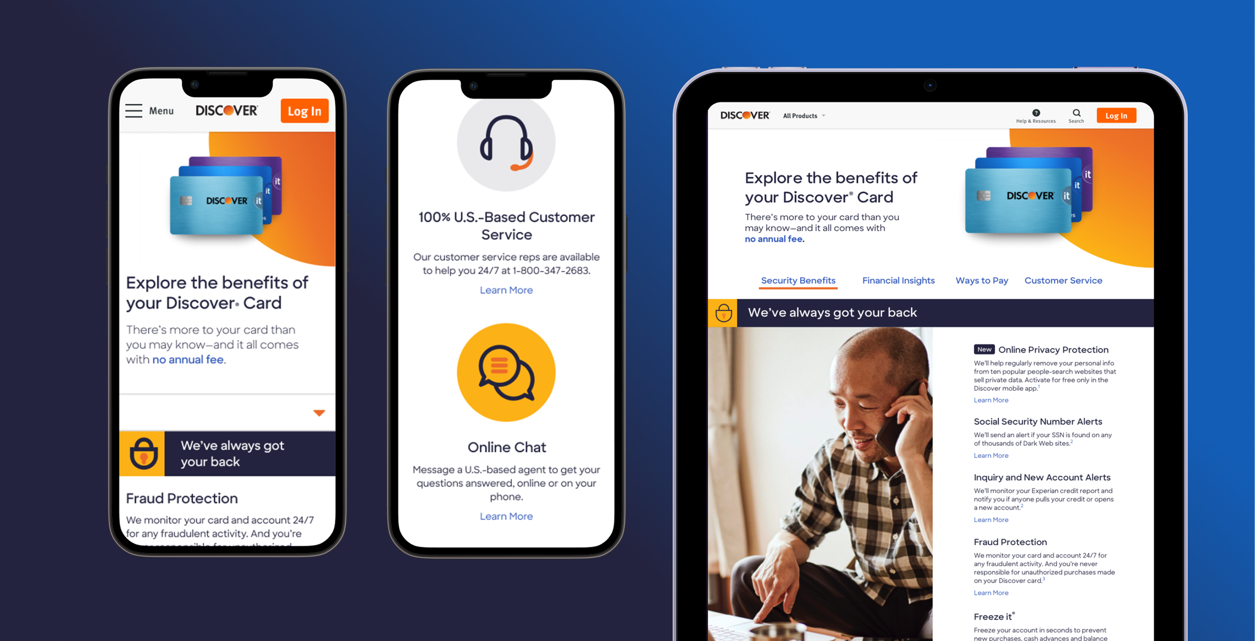
Updating design elements to feel more modern elevated the brand experience while improving usability.
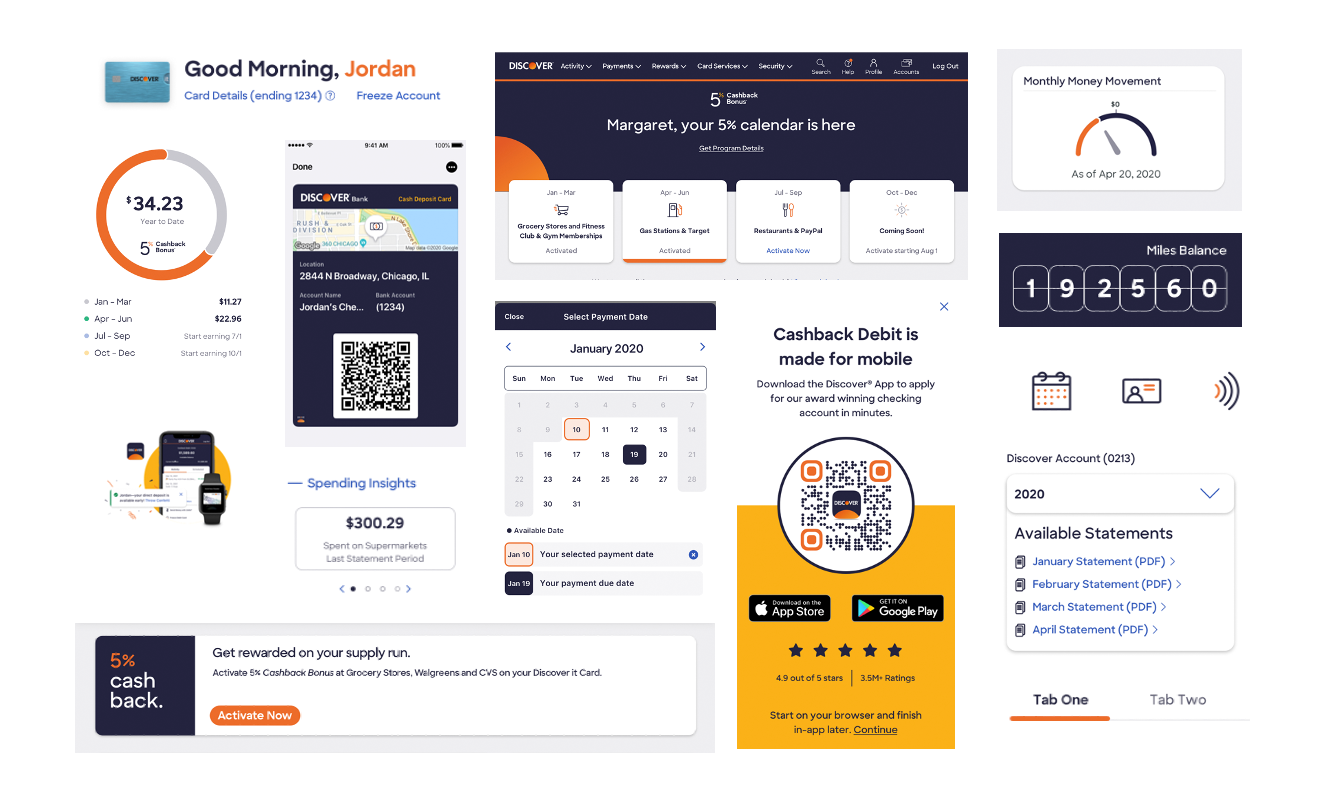
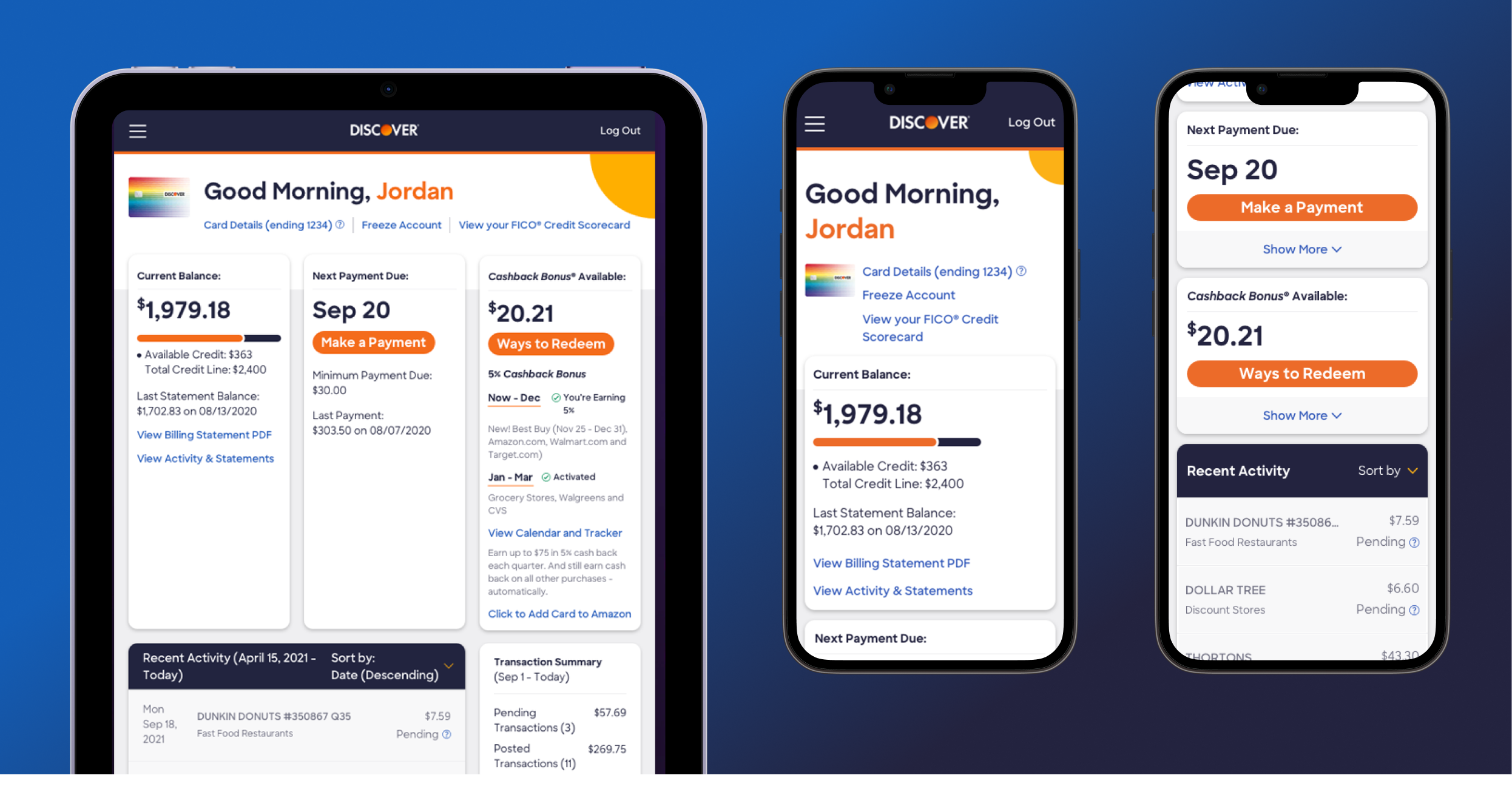
The website and app experiences became more unified sharing components.
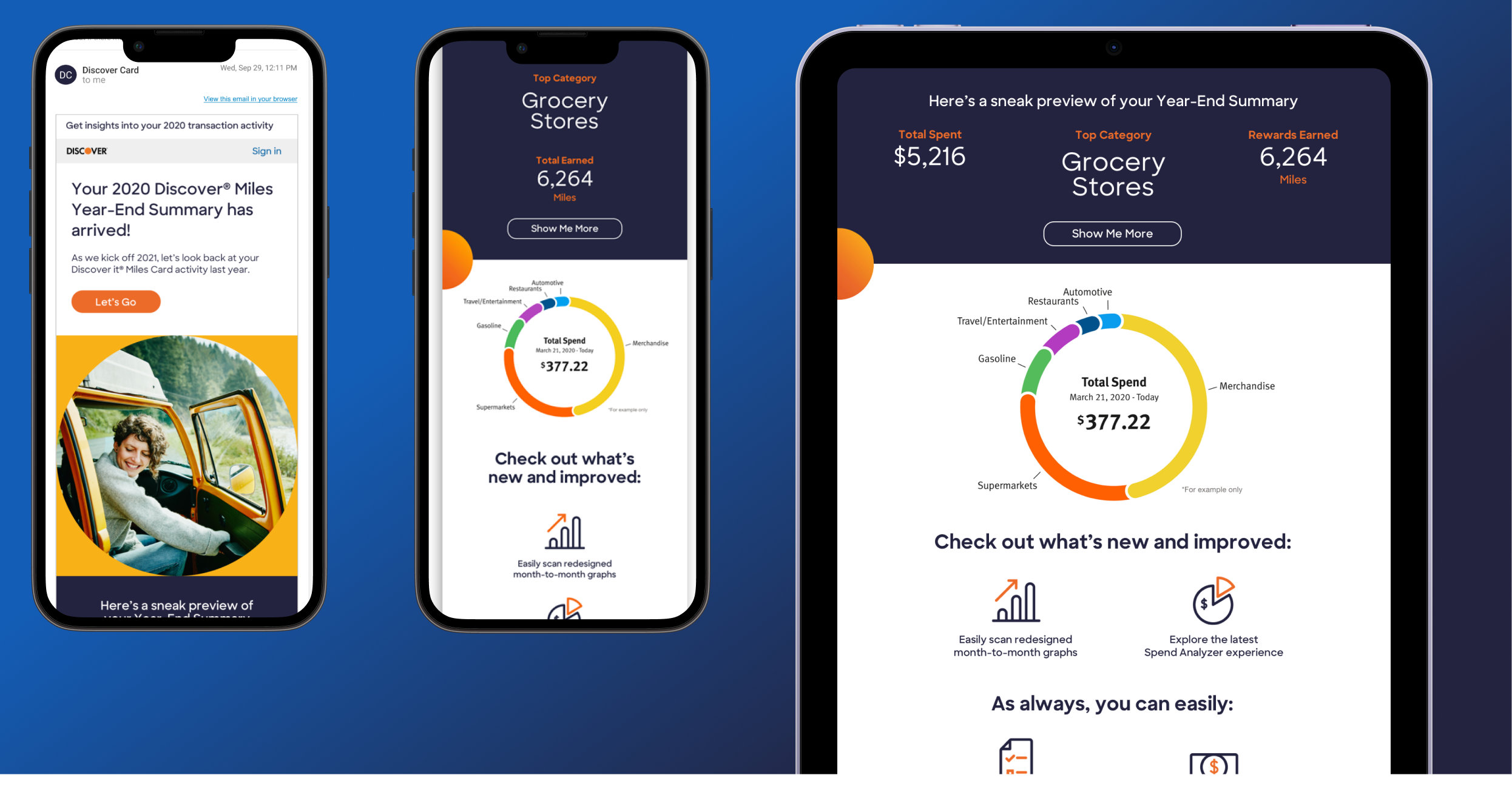
Emails also shared patterns, buttons and iconography with website and app.
While the new process was a change for some business partners, it ultimately sped up production. By limiting bespoke experiences, customers benefited from a more cohesive brand presence and a dependable user experience across apps, websites, emails, and display ads.